How to Change the Microsoft Office Color Themes

Office 2016 and above has extra color themes to select from versus Office 2013. Here’s a look at what each one looks like and how to change them.
Microsoft Office has new color themes to select from versus Office 2013, and they are much different than Office 2010 and below. Here’s a look at what they are and how to change them.
Change the Microsoft Office Color Theme
Launch any Office program and click the File tab and then Account. There under Office Theme, select the color you want from the drop-down menu.

It’s also worth noting that this is where you can change the Office Background as well.
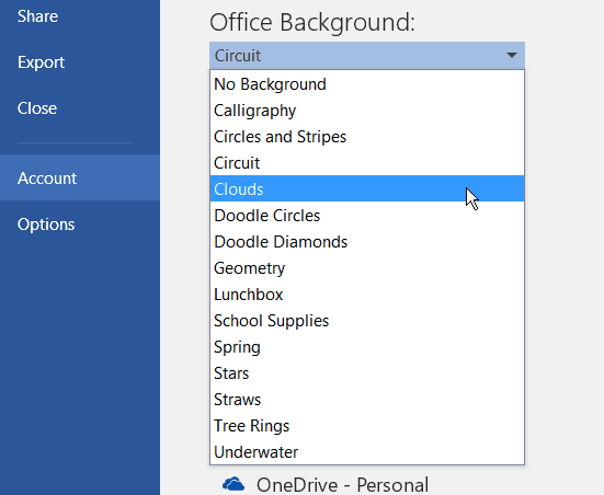
Another way to modify the color and background is to go to File > Options, and under Personalize your copy of Microsoft Office, select the color you want from the drop-down list.

Here’s a look at each of the color themes currently available in Microsoft 365 (formerly O365).
Colorful
Dark Gray
Black
White

Keep in mind that it will change for all of them if you change the color in one app. Also, remember, Office 2016 (at the time of this writing) is still in beta, so Microsoft could remove some of these colors or add more – I hope for the latter.
What do you think of these color themes? Do you have a favorite or wish there were more? Leave a comment below and let us know.
Jan
May 30, 2015 at 2:20 pm
So “colorful” just means blue? Big whoop! Still, it beats white, grey, and greyer or black, so I’ll take that over Word 2013. But what do they have against the old method of letting Word windows change colors when a user selects the colors for other active and inactive windows? Is the programming involved too time-consuming? Or has someone who prefers his/her world BLEAK decided to foist it on the rest of us? Again, I do appreciate the blue scheme, as at least having a real color. But it would be nice to have one scheme with a warm color for a change.
Ron
June 3, 2015 at 8:15 am
Jan, colorful means that every app has its own color. Excel is green for example.
Jan
July 10, 2015 at 9:20 pm
It also beats me how giving each app its own color is anything special–i.e., deserving of the name “colorful”. I have nothing against the idea, especially for apps like Excel, but Windows is used for so many things that I really want to be able to make it whatever color I want.
Ciprian
October 22, 2015 at 2:13 am
Jan, exactly. It is really lazy of them to not have been able to include whatever hex color for the themes, especially for each module of each application in particular.
Radu Mihai
December 11, 2015 at 6:37 am
I just got one yesterday at work – professional and has only 3 colors Dark grey, white and some kind of dark brown under “colorful option” which sucks by the way – when you have a shortcut selected that brown would not allow you to see anything under it so you have to know exactly the position of your shortcuts
Too bad that 2010 was more user friendly than this one …Cheers
Steve Krause
December 11, 2015 at 7:41 am
Yeah…. 2013 and now 2016 are both pretty grim when it comes to the color themes. Hopefully Microsoft listens to its users and provides us more options in the future. Unfortunatly, all my contacts there tell me it’s not on the backlog (yet….).
Holly
December 11, 2015 at 6:49 am
I agree!! There really should be color options to choose.
Radu Mihai
December 17, 2015 at 9:34 am
I went back to 2010 version after i tried to modify the luminosity on a picture in excel and every time i was changing something the picture would disappear After i tried few times was able to have the picture there but the spread sheet would come with no picture when i was trying to print and i hate that every excel spreadsheet is in another window
ON the other hand Outlook would not allow me to select multiple attachments in the same time
DF
March 29, 2017 at 10:44 pm
Sorry, I meant “Word,” not Windows in that July 10 comment of nearly 2 years ago! (Was just rereading this thread and bemoaning the lack of any sign of progress from Microsoft.)
DF
March 29, 2017 at 10:45 pm
P.S. DF=Jan At some point, I unthinkingly used a different name.
Sheri Baxter
August 8, 2017 at 10:13 am
What Jan said!
Good going taking away our options
Bumfuzzeld
May 19, 2016 at 4:52 pm
BLEAK is the correct word. I liked when you could actually customize EVERYTHING. It took a while, but it was nice that it met your desire. Of course the world is changing…everyone is in politically correct, lock step. Now instead of “Send To”, you “Share”. Really? I attach it to an email.
Makes me want to barf.
Charles J Candiano
May 6, 2018 at 9:44 am
“Bleak” is giving it too much credit. Microsoft should offer lithium to subscribers. Adding ONE color (per program) to the banner, only, is hardly “colorful.” I long for the old days of Outlook and the “rugby” color scheme.
Paul
January 3, 2017 at 7:31 am
I have a hard time focusing on the 2016 ribbon color scheme. The text and the background seems to blend together with similar colors. I hope that Microsoft goes back to the previous sharp contrast color schemes. I just switched to the gray scheme that at the moment appears easier to look at for now.
Jane
May 9, 2017 at 2:02 pm
I also had to switch to the gray scheme because the extent of blending in the White and Colorful schemes made it so difficult to focus.
Julie
May 23, 2017 at 8:17 am
I agree. In Outlook, the lack of contrast and lines between emails is certainly less pleasing, and puts just enough strain on my eyes to make me uncomfortable.
Claudia Fornshell
August 3, 2017 at 11:38 am
I totally agree. Very hard to see. When I switch to dark grey it is just awful! Definitely need more choices and ways to customize the different programs!
Nat
June 13, 2018 at 9:19 am
I agree! There is not enough contrast no matter what them color you choose,I keep trying to drag the wrong screen when they are stacked because they just blend to much.
Benson
February 24, 2017 at 2:10 am
It’s BLEAK indeed! And I found “colorful” misleading. I could do with a few more options
Nelson Tun
June 22, 2017 at 6:55 am
I use Excel 2016 (company supplied) extensively and the only “color” (black & white are not color) you can get is “Ugly Green”. This reminds me of Ford Model T back in the days any color you want as long as it is black. thank you MS for your generous options.
They did the same thing with Outlook where you can not customize the “folders” where I have 100s of them all same Manila Folders.
Simso
July 6, 2017 at 12:59 pm
And it only means the upper menu bar is blue. I used to be a little obsessive about customising the look of office and find these limitations very dreary. After all, like millions of people, I use my computers constantly. Of course we want to ‘individualise’ them – just like home and clothes! I think it is a big mistake of microsoft to ignore these details.
Terri
April 6, 2018 at 1:53 pm
Yes please on more colors! The overabundance of blue is bad for our eyes! Love your comments Jan, I feel the same way.
Deb
June 17, 2018 at 8:07 am
Boy, I’m so glad to hear other people complaining about this. The whole idea of having “color” apps is ridiculing and should be the user’s choice! Not allowing users to choose what colors they want apps to be and adding color into our sometimes dull work environment, again ties us into the Microsoft dictate!
James H
July 5, 2018 at 10:22 am
Would like more choices. Outlook and Word are both blue – slightly different shades, but still blue. PowerPoint and Access are both red/orange – also would like to differentiate them a bit more. I’m not finding a place to customize.
Jan
June 3, 2015 at 12:23 pm
Thanks, Ron. I sure didn’t know that.
But it still doesn’t change how I feel about the bleakness and lack of color in MS Office, especially Word, which I use the most.
Steve
July 9, 2015 at 8:39 am
With the latest Patch Microsoft has just removed the Black Theme and forced all the users to use the Dark Grey theme. Seems we are going back to the typical, give users a bunch of options they want in the beta and then take everything away and leave a husk of the original product by release….
Steve Krause
August 1, 2015 at 11:05 pm
… I really hope not. On the Mac side, it’s still pretty bland. Just hope they give us more options on the Windows side of things.
Jan
September 5, 2015 at 3:09 pm
Oh no oh no oh no!
Jan
December 4, 2015 at 8:17 pm
The thought of the ‘great’ choices for Word, ranging from blue to white to dark grey or black amusingly just brought back a memory I have of a very old record spoofing the Kennedy family, in which Jackie was leading a tour of the White House or some other famous building whose walls were covered with oil paintings, and she was saying, in that soft and breathless tone she had, “And there’s THIS one…and THIS one…and THIS one…” without ever saying anything different about any of the paintings.
D.
July 10, 2015 at 7:12 pm
Does anyone know where is this (Go to >Account>Office Theme ) thing on Office 2016 for Mac?
I go over to Word>Preferences>General>Personalize>…. and then nothing, just 2 choices. It is sad…
(When I type in Print Layout Mode, the page color and the background color are both too white. For instance, in previous Word version, the background was dark grey and the page was white -obviously- So, I dont know what happened…)
The darker themes above looks beautiful. I hope there is a way to do the same thing on Macs as well…
Anyone can help? Thank you.
Steve Krause
August 1, 2015 at 11:07 pm
We did a writeup on the Office for Mac 2016 – https://www.groovypost.com/howto/customize-office-2016-for-mac-color-theme/
As you mention…. not many options as of now. Just the two. Hopefully Microsoft will add a few more options so we won’t need to go looking for a 3rd party.
K
August 13, 2015 at 4:26 am
Can I still enable the dark theme feature even if I’m not logged-in to my account?
Thank God
September 5, 2015 at 1:10 pm
About f#cking time…. These light themes on 2013 are HORRIBLE……
Where is the office 2013 to 2016 upgrade link?
frank
September 9, 2015 at 1:20 pm
try working a few hours with the new color schemes and if you are over 40 you will most certainly get eye disturbancesr headaches. i personally and in my company on the request of the users reinstalled office 2007 which has that nice pale blue backgrounfd that is not so straining on the eyes.
frank, italy
Valdez
August 17, 2016 at 1:37 pm
Yes, my head and eyes are bothering me!!!!!
LJ
March 24, 2017 at 7:00 am
AGREED. THIS IS GIVING ME A HEADACHE. Very tough to work on.
Steve Krause
March 24, 2017 at 9:48 am
Yeah I agree…. not the greatest color options…
Rolf
August 22, 2016 at 8:32 am
Yes it´s really BAD! I can´t se anything anymore.
I would like a mix from (Color and Dark grey)
Stefan
September 26, 2016 at 7:38 am
Yes, the appearance is really annoying.
On one side the default “Color” doesn’t provide visual distinction (especially in outlook) between the different areas. While “Dark grey” is much better it still suffers from the Flat-Windows-10-Style look. The visual grouping / organization is inferior to Office2010.
On the other side “Dark grey” loses the advantage to recognize the different Office programs. A Mix of Dark and Color would be useful and surly simple to implement.
Dan
September 26, 2016 at 11:46 am
I TOTALLY AGREE!!! These pastel colors SUCK!!! I can’t see them and it gives me a headache.
Ken
December 17, 2018 at 5:32 am
We just moved from Office 2010 to Office 2016. I noticed the color grid under the VIEW tab within the Outlook 2016 calendar only has pastel color options… So the colors on the calendar don’t contrast as well and become less distinct to the eye. Hopefully the pastel colors will be removed or at least more prominent color options provided.
Tron
October 1, 2015 at 9:45 pm
Office 2010 was the last good release–it actually respected your general windows theme colors, title bars etc… 2013 was a joke! Even with 10000s of unhappy users screaming, pleading, begging Microsoft to bring back the regular colors…nope! “WE know what’s best for our users!”
I don’t know how anyone could stand the million candle-power white staring you in the face…and the ALL CAPS menus (WTF?). 2016 is a little bit better, but heaven forbid we have a program that respects the general windows color schemes.
That’s right up there with “We are putting the start button back in windows 8.1!” Yeah, it just goes to the metro screen anyway!
stan
October 8, 2015 at 8:20 pm
I had a IBM pc when they first came out…256k..mine might have been the second string, I think the first was 128k….anyway….I used to spend countless hours late at night downloading software from bulletin board services, mainly communications software. most of them would let you change your screens to any color you’d like and you could vary anything you wanted about them…I think outlook professionals think let’s keep it conservative because we don’t want to change the base because this might scare people away from the norm or even cause people to look at a colorful scheme and then think it’s just another ‘wow’ program that loses its unprofessionality. Unfortunately, with this mindset, they don’t understand that they’ve got an excellent piece of software that needs to be tweeked by the users. some users need colors and ‘wows’ to make them want to buy the thing, like ‘little ole’ me’….and plenty others i’m seeing. let’s give the user a chance to make their screens ‘wow’ screens again because some of us need this to come back again and again to the outlook product!!
Pete
October 22, 2015 at 3:35 am
Hello.
I just acquired Office365 and configured the theme as suggested, and the one that works better for me is the white. However the reading pane and headers still seem a bit blury compared to the previous outlook.
Is there a way to configure the theme in general so that the fonts in general will look more bright or intense?
Thank you!
kayLacs
November 4, 2015 at 5:55 am
Office 2016 Display Taskbar option was removed. So it shows a lot of screens if opened multiple files. NOT GOOD.
Jan
December 12, 2015 at 1:01 pm
“Office 2016 Display Taskbar option was removed. So it shows a lot of screens if opened multiple files. NOT GOOD.”
Good heavens! What torture will they think up next? (And I am not trying to be funny.)
Maybe this problem with the taskbar and the lack of freedom to choose colors (the lack of colors TO choose), is something like that old saying that if you set a monkey to typing and give it an infinite amount of time, it will eventually turn out the entire Encyclopedia Brittanica.
I say this, not to imply that MS employees are monkeys, because they are no doubt extremely intelligent people. It is just that I imagine that (the corporate system being what it is) there are a large number of people at Microsoft whose jobs depend on turning out “improvements” to various products–the OS a major one, but also things like Word. They can never sit back and say, “Almost everyone seems to like Word as it is, so let’s leave it alone.” Nor can they afford to just make one or two “improvements” to it now and then. They have to be constantly revising and providing fodder for updates. If they hadn’t made so many so angry, I would pity them.
Like the monkeys in the saying, they eventually arrived at the point of making hideous non-color choices for Word 2013, which also make it not only unpleasant for a lot of us to look at, but actually quite difficult for people with poor eyesight (of whom my poor husband is one).
I do appreciate useful updates like the one in Word 2013 that allows one to deal with “Track changes” by turning “Show markup–Insertions and Deletions” on and off in the margin, instead of the ribbon, but can’t help feeling that colors could have been left alone.
Hey, Microsoft, if anyone WANTS to work in a world without color, you could just give the rest of us a lot of color choices the way it used to be (I mean, way back when, when you could choose any number of colors for the title bars of any windows you might want to open–not just Word), and let people who think white, grey, and dark grey look more professional choose those “colors” to their hearts’ content. I will have red shading into yellow for active files and lavender shading into turquoise for my title bars, and Word will have strong lines showing where things (such as the scroll) begin and end, whether or not I am hovering over them.
But it’s just a pipe dream, huh? (sob)
AshTacks
December 4, 2015 at 10:24 am
Is there anyway to change the color scheme in just one office program? Or if you change one you change them all?
Endre
December 9, 2015 at 3:43 am
It seems, Microsoft intend to go back the 8 color scheme. Or go further, use only monochrome GUI. Why not ? Or use white ink on white background ? The development is borderless.
Seriously, our monitor is able to handle 16m colors. Think about Microsoft. It is not only a feature, rather an obligation to developers to utilize. The Windows10 new monocolor GUI is rather annoying than pleasing. The new Windows 10 logo is also a big step backward.
Unfortunately, the other software companies following the MS new design ( Adobe, Corel, etc.) The new Adobe Reader DC is also a disaster.
Fortunately, I’m old enough to force the use of this design long time.
Jan
December 12, 2015 at 1:10 pm
Yess!!!!! White ink on a white background, and no borders! The ultimate in professionalism!
Whatever company decides first to provide its word-processing software with plenty of colors and at least a clearly visible/nearly invisible border toggle may surprise the world by the huge number of sales it makes.
Color just might give Corel or some other smart company a bit of an advantage over MS.
Lisa
December 20, 2015 at 1:12 pm
What I don’t understand is the lack of colors AND the idea that they would go back to prehistoric Microsoft and make EVERYTHING FLAT! What where they thinking? We are in the world of Hi Def. Monitors, TV’s, you name it, it’s high def. And now they decide to remove almost all of the color choices AND make it flat and visually unappealing in a world that is huge on color and appeal. And from what I can see it would appear Windows 10 is pushing the same boring look. I won’t be buying it anytime soon. I’m looking for new and cutting edge color and technology. Not 1980!
Melanie
March 7, 2016 at 11:35 pm
It’s the triumph of Design over Usability. Microsoft has NEVER grasped that Design should improve Usability not make life harder.
Jan
March 8, 2016 at 8:54 am
Melanie, you put it perfectly:
” the triumph of Design over Usability”!
Andy
May 20, 2016 at 1:37 am
Well the more classic saying is Form over function, and yes this is so often correct.
Rolf
August 22, 2016 at 8:43 am
Agree totally.
Also annoying the new ClearType fonts, making everything blurry
or put spaces between letters where there aren’t any.
It´s like not having any chance to put the display to the native resolution anymore.
A Clarke
January 13, 2016 at 8:00 am
For those of us struggling with migraines, eye strain, etc., it’s important to be able to darken the screen and/or change the background to something other than bright white. After only a few minutes attempting to read/type in Word 2016 my head begins to pound. Previous versions of Office/Windows allowed the user to modify the page background settings to deal with this handicap – now you cannot find it even in the high contrast settings.
Max
March 25, 2017 at 11:03 am
Totally agree!! I have chronic migraines and looking at the white screen in Word, Excel, etc kills my head and affects my work. They should really give the people the option!
Andrew Johnson
May 6, 2017 at 8:59 am
Is it any wonder I loath the versions of Word/Office after 2003. 2007+ has a user interface not designed for power users – where things are 3 or 4 clicks away rather than 1 or 2 and you can’t change your page background to anything other than bright white, as others have observed. I guess it’s not only NASA’s manned space flight technology that has gone backwards.. But at least you don’t have to use the latter to earn a living..
Nan
January 14, 2016 at 8:54 am
It would be very nice if we could choose our own colors. Those that you have offered up are not very attractive/boring. The green in Excel is a horrendous color. I totally agree with many of the above posts that we need more color options!
Jan
January 14, 2016 at 12:04 pm
If, as someone suggested above, Microsoft is not being lazy, but is entertaining the misguided notion that everything must be flat and practically without color in order to look professional, they might consider this:
Last week I watched the CNN feature Steve Jobs, the man in the machine, and was startled to see the pictures of the original “personal computers” that sold so well and took Apple to new heights. They came in several beautiful bright colors. I wish M/S would ponder that fact and realize that they can win more customers for Office if only they would give us more freedom with colors. Personally, if I ever stop doing the sort of work I do now, which requires me to use Word and Excel, I will be only too happy to seek out some other, more colorful programs for my personal use. Meanwhile, I can only pray that all the other companies are not infected by the minimalist bug!
Julie Unsworth
February 6, 2016 at 3:50 pm
I hate all the new versions for the very reason that it is BLAND, BLAND, BLAND. Makes my eyes sore staring at a white screen and scrunch up staring at a Dark Grey screen. Hope Microsoft get the message soon and go back to how it was in 2007!!!
ansamelany
August 1, 2017 at 3:42 am
There are no usability test done on these products i think. look and feel is very very bad and bland.
Monica
February 10, 2016 at 7:52 am
I don’t care that the new color scheme is bland, but it IS hard to look at. Everything is various shades of gray. If the default font for folders and viewing emails were at least black on a white background it would provide better contrast so you could read emails without causing eye strain. Seriously – there’s a desperate need for a patch. FIX THIS!!!!!!!
Bobbi
March 11, 2016 at 12:40 am
I think it sucks that Microsoft Word 2016 only has 3 color options for the background. I don’t have the option for a black background. I have no idea where you got that from? How come we don’t have an option for a St. Patrick’s Day background or something pleasurable like that for us?
joe
March 20, 2016 at 11:50 am
What if you want to change the color of the page, not only the borders and menus?
But just for reading.
I mean, if you print it you’ll get a white page but in order to read it you prefer black paper and lightgrey letters
Bumfuzzled
April 8, 2016 at 8:24 am
In Office 2016/Windows 10, how do you change the default color of the page in Word and Excel (on page in Word and the cells in Excel, when opening a new blank file)? I had Office 2007/Windows 7, and changed a global setting that set the default workspace to gray. I upgraded to 2016/10, and it carried over. I now want the default background to be white, but cannot get it to change. The theme colors in Account settings do not do it. Thanks for any help !
Rob Smith
May 19, 2016 at 4:20 pm
Am I the only one complaining about Windows 10 and Office 2016 hurting my old eyes?
The colors are woeful, either too white, lack of color choices and generally really hard to read.
Liz
December 22, 2016 at 7:04 am
It’s KILLING my eyes. Time to put some old farts on the development team!
graham
March 6, 2017 at 4:46 pm
Totally agree – the text is getting to be a paler shade of grey and the white background with white paper makes it impossible to see your layout in “print”. These wishy-washy colour themes are just not user friendly and leave my eyes watering from strain. Or then there’s black or dark grey – to extreme in the other direction and STILL the text is grey. It’s not discrimination to use a bit of contrast, Microsoft.
Jan
May 21, 2016 at 9:40 pm
No, as you can see above, my husband and I have been complaining, too. Besides the pale, pale colors, I do not appreciate having some things remain invisible until the cursor nears them! What’s the point? Flat, colorless or pale, and sometimes invisible! What’s not to love? (HAH!)
CC West
June 3, 2016 at 3:43 pm
I just want to change the color of the wording in my emails? Is that not an option? I don’t like the blue words.
Jocelyn Hughes
June 18, 2016 at 4:35 am
What a bland palette that is on offer with no option to customise, I have several calendars and pale pink versus pale yellow aren’t great options. I used to have vibrant colours to clearly see at a glance which calendar I was working in. what happened to the option to select your own choice – 9 limp shades is not what I call colourful. Does anyone know of an add-in that that overwrite this lack of choice?
Steve Krause
June 18, 2016 at 11:44 am
I don’t….. but yeah, Microsoft has been getting a lot of heat over this one. Perhaps someone here in the community can suggest a 3rd party tool (however, I’m not very confident MS actually allows 3rd parties to screw around with the Color themes…).
Mack Piotrowski
June 21, 2016 at 10:29 am
I like the Black theme. Is there a way in Excel to make the formula bar be white. highlighting a cell range to change a number is hard to view.
Eliza
July 14, 2016 at 12:29 pm
I, too, find the colors of Office 2016 awful. I am forced to go back to my old computer, which is loaded with Office 2010, to work on powerpoints because powerpoint 2016 just truly hurts my eyes! Not only is the ribbon color ugly, the screen brightness adds to eye strain. PLEASE MICROSOFT do something!
Sandie
July 17, 2016 at 4:19 pm
Really, Microsoft. How hard would it really have been to all us to customise to ANY colour we want??
I have 3 choices only on my outlook and I’m not liking any of them. The blue is harsh, the dark grey makes it look like you work in a cave and the white is just plain boring. Wake up!
Beth
July 20, 2016 at 10:36 am
So, I have sensory issues and have been able to customize the background colors on Microsoft to colors that don’t bother my eyes. Are there no other options to filter the screen glare than Blue, Dark Gray and White? the light gray background with the Dark Gray option is fine, it’s the contrast of the Dark Gray that is too much! Can nothing else be done? Before I had so many options to customize . . . it seems like this version is going backwards in time.
Mark
July 30, 2016 at 4:31 pm
I am trying the Office 2016. I have 28 days to go, but the UGLY GREEN RIBBON on Excel 2016 page has to go! Can I get rid off it? Gray or lite blue (even a liter green) would be fine with me. Can anyone help? Thanks.
Susan
August 11, 2016 at 12:21 pm
It is always one step forward, three steps back with Microsoft. I have low vision and migraines and the new Office is killing me. It is just insane that 20 years ago, it was better on your eyes than it is now. And most of the time, Microsoft could not care less what the users think so good luck to us on getting anything better out of them.
John
August 15, 2016 at 3:33 am
Trialling Windows 2016 for 30 days – currently unimpressed with the LACK of colour options
Jamie
August 15, 2016 at 10:05 am
TERRIBLE. With all the technology out there in 2016, Microsoft should have a ton of color and theme options for this! Get on it!
Kika
August 25, 2016 at 6:57 am
HORRIBLE!!!! torture for eyes. I don’t like any of the Themes, even 2010 have the light gray which was better. Very disappointing and this is my work computer…In my family no one will buy Microsoft products anymore!
Robert Lake
August 29, 2016 at 6:08 pm
It seems that I am not the only one who is disgusted with Microsoft for changing such a useful option. Apart from ditching Office, has anyone actually found a solution to Microsoft’s created issue?
As of today, it seems I can only have a white background, whereas last week it was my preferred light green?
amjad moghul
September 7, 2016 at 2:47 am
Hi Robert,
I installed 2013 knowing that they had messed with the colours, and eventually went back to 2010. I dont know why MS thinks it needs to force people to use the bland and grey look on everyone, and then not let them change it either. Something which is very easy to do for them.
Instead they decide to take a leaf out of Apple’s book where everything is predetremined for you.
And the colourful options dont look like options at all. They just give a colour to each application! How useful is that?
Is it any wonder why MS phones have tanked? Why Windows 8 Tanked because they want s to go to a totally new (and useless) way of working. Even if you had given us the choice to say pick the new Desktop tiles or the Old start button – but no, they bet that we would keep buying like Apple fans, but instead people voted with their money
Give us flexibility MS, and we will continue to support you.
The fetures in 2013 didnt justify the lack of colours and bland look for me. I imagine 2016 will be the same. So until they listen to the user – I’ll keep to my Windows 7 and Office 2010
Lorna OBrien
September 3, 2016 at 9:39 am
Not happy about the very wishy washy look of ‘colourful’. Very hard on the eyes.
J. Crane
September 6, 2016 at 6:07 am
The color tones mandated by Microsoft are either too glaring or overly stark/bland. My eyes protest looking at the screen immediately and actually ache after an hour of working with the programs. I guess that’s part of Microsoft’s office-exercise program, because it keeps me away from the screen a lot more. Any little errand to get away from the color scheme is welcome.
Simply put, the colors are hard on the eyes when one has to look at the computer for work all day. The more muted color palette of the Word 7 AND the ability for the USER to select the color tones really needs to be returned to the Microsoft programming. Especially get rid of that red tone Microsoft is foisting on those who use Powerpoint 16. Yech! Gives a whole new meaning to “Murder, She Wrote.”
Let us at least be able to (easily!) CHANGE the palette to one that suits us individually. And, just perhaps, Microsoft could consider contracting people who specialize in ways to reduce eyestrain when they do their design color selection, to test it first..
bob hyde
September 15, 2016 at 2:37 am
There really should be colour options to choose, perhaps pale blue or green.
This may help more mature people.
DF
December 17, 2018 at 9:45 pm
Well, Bob, I appreciate anyone’s comments asking for more colors, but I am so “mature” that I have begun using a cane, just to make myself look down and stop tripping and falling. Yet I would by no means be happy with just pale blue or green!
laura
September 19, 2016 at 9:07 pm
It still does not leave this option to alter the color theme at all on my macbook pro, I’m still at a dead end with a blinding white screen to try and navigate. No problem if I transition to a a PC, but utilizing MS Word on my Mac is impossible right now and it’s so frustrating because that’s what I use for everything school related.
Does anyone have any suggestions without having to do a mimimum of a theme change before and after submitting papers?
I also have this problem with internet sites, I can’t see fields where I am required to type information into such as name, email, etc… and all of my software stays very UTD.
Mike
September 23, 2016 at 8:01 am
I seem to remember in (really) old versions of windows you could change the colour of all things, and that was in the days of rubbish monitors. Now i have a lovely 4k curved monitor and I can only work in ‘colorful’ (read horrible) or bright bland; what a waste of a few million colours!
Cut a long story short, 20 years on and now with marvelous hardware and I get sore eyes, and all because of someone else’s view of what a good colour is. Please Mr Microsoft let us decide on what a good colour scheme is….
Mark McDonald
September 24, 2016 at 1:23 am
How do you get rid of the cursor delay.
Noticable when you type a long line, then a very short one.
Then you move the cursor with the arrow keys.
Its very annoying to me, I cant explain it.
Mike
September 24, 2016 at 1:53 am
Sorry can’t help but I agree that cursor delay is really annoying
Bryan
March 1, 2017 at 2:40 pm
If you’re still searching for a way, you need to turn off the Office animations. Follow this link: https://support.office.com/en-us/article/Turn-off-Office-animations-9ee5c4d2-d144-4fd2-b670-22cef9fa025a
This will turn off all than can be disabled and it’s the only way I’ve found to turn off the gliding cursor in Word (and Outlook).
Alternatively, in Excel within the Advanced Options, you can disable the option to “Provide feedback with animation”, which kills the animation of the cell highlight gliding from one cell to the next selected cell. Word has a similar checkbox in its Options, but it doesn’t turn off the gliding cursor.
I’ve been using Office 2016 for one day and have found only a few things that I particularly like about it over the Office 2007. One of them being that it fixed having to minimize Excel before moving the app between multiple monitors, but that was fixed in 2010. So, maybe there is nothing better of Office 2010!
Terry
October 4, 2016 at 8:13 am
I have MS 365 which I suppose is the same as MS 2016. The colour themes mentioned here don’t work. I have simple black and white. Worse, I cannot use colour in my fonts or highlight. If I indicate, for example, red text – it shows as black – although when I cut and paste that document to wordpad or print it out on a printer the colours then show. I suspect it may be related to formatting that is done without my knowlede because initially even the hyperlinks were in black. Then, when I used the “remove formatting” the hyperlinks showed up in blue – but all other text, highlighting, fill etc still fails to show colour. Can you help?
Steve Krause
October 4, 2016 at 5:50 pm
When you say MS 365, do you mean Microsoft Office 365? Make sure you are running the latest version. Open Word, Click File > Account > Update Options (drop down) > Update Now.
The latest version of Office 365 (aka Office 2016) is Version 1609 (Build 7369.2024).
If you have an older version that’s not updated, you probably need an update.
stephen joseph zack
October 4, 2016 at 1:28 pm
One word comes to mind: “fhidious”
Terry
October 5, 2016 at 7:33 am
@Steve Krause. Thanks for detailed reply. Unfortunately, all aspects you have mentioned have been applied. It is indeed Microsoft Office 365. It is the latest version. I have tried all the “color themes” as detailed above – none have any impact on my black & white screen. I have opened various Word templates – none show colour when opened, except for permanent aspects of the design. “Place holder” titles and text in color show in black & white only. I have defined more precisely the problem.
1. It applies to the following Office 365 aplications: Word, Excel, Outlook, and PowerPoint. However, OneNote is OK, allowing text and highlighting to show in any colour. As well no other program on my computer that allows coloured text is affected – thus my computer settings are not the problem.
2. In these faulty applications, color can be applied and is shown in the subequent document when it is printed out, e-mailed, saved to an other device, or “cut & pasted” to OneNote or Wordpad – but it cannot be seen within the app on the screen where it is originated. Thus I had multi-coloured emails and attachments being sent to colleagues who suspected that I had become senile, because unknown to me, the text was brilliantly multi-coloured – reflecting my failed attempts on the originating computer to obtain color.
3. More detail: when colour is applied to text, while failing to show the colour on the screen, the “Font colour” icon in the “tool bar” reflects the changed colour when the cursor is placed on that part of the text. (i.e.when the icon is opened to show available colours, there a black border around the colour of the letter on which the cursor is stopped.)
3. A further bizare aberation: Even within the faulty MS365 app on my screen, Email addresses and hyperlinks turn blue and are underlined when inserted into a text, as they should, even when on the screen – unlike any other attempt to show applied colour..
LABurlet
October 5, 2016 at 4:55 pm
Steve – how do we change the border thickness of windows within Office 2016? i.e. talbe and query windows within Access are only 1pixel wide and very difficult to grab and resize
Ron Lynch
October 11, 2016 at 3:14 am
Any way to change the font size? E.g. on MS Outlook 2016… When reading an incoming email, the font of the header information is minute and is causing me eye strain. I can change the font in the screen that lists messages, but cannot work out where to change it for the email headers. I can change the font within the text of the message itself using the mouse wheel, but the headers have alluded me so far. The same applies when editing a new contact.
Endre Tollar
October 16, 2016 at 4:17 am
I think, Microsoft has no time to watch – or react to – our complain. They are too busy to develop less color scheme. Anybody heard about positive reply from Microsoft ?
The first comment has been born 17 months ago !!!
Terry
October 16, 2016 at 2:04 pm
MS did not react to our complaints. But I opened a “chat” and got a technician (I think he was in India by his name, but there is no accent on “chat”). He immediately solved my problem (see my post on Oct 5). He took control of my computer, went into the control panel/personalization/change the theme, and changed my WINDOWS theme. He told me in the chat that there was an incompatibility between MS365 colour themes and Windows themes. The fix simply involves changing the Windows theme, by trial and error, until one works. In my case the first change did the trick. ALL my colour works now, i.e. themes, fonts, highlight, fill etc in Word; it also now works in all the other MS Office applications such as PowerPoint, Excel, Outlook etc. I was impressed by the quick fix, which did not cost me anything because I had just bought the Office programme, but I am disappointed with Microsoft who has NOT adised its clients of this simple fix for an apparently widespread problem. I am also astonished that it seems prepared to leave the problem unfixed.
Randy Carbary
November 1, 2016 at 4:21 pm
I agree with most of the others who are underwhelmed with the new Office 2016 Color Scheme. Did MS hire coders instead of graphic designers or what? I have never witnessed such a visually painful update. I use (3) computer screens all day long. I am using the (Arctic) White setting and I thing I am going to go Snow Blind!
NormalOldUser
November 13, 2016 at 4:34 pm
I am squinting at the grey options screen – grey used to mean ‘disabled’ so we knew status. Are my options disabled? No, they are very much alive. Very confusing. I am having trouble seeing them because the grey is nearer white than black, even grey on grey background for the headings. ARGGHHH!
I have held our agency from updating Adobe DC when it started with lighter greys than it has now (still not right); I will see if I can ask it to keep Win 10/Office 2016 back until they get proper text.
Why oh why to they keep breaking things that were working fine for most of us? OK, give some users darker colour schemes/contrast, it’s important to do that.
Normal older users are being DISCRIMINATED AGAINST with this industry propensity towards pastel grey text.
NeedCalendarHelp
November 23, 2016 at 12:48 pm
Does anyone know how to make the “Show as: out of office” colour more prominent on the Outlook 2016 calendar? I can barely tell where I’ve put those days in my calendar.
Tony E.
November 24, 2016 at 5:32 pm
If the Colorful (green), black, dark grey white are the only options for the ribbon I think the designers need to take a pay cut!!!
Fraz C
October 30, 2018 at 2:36 am
Lazy for not even offering a ‘classic’ option to show the old default scheme, or arrogant for believing they know better than us on what constitues a required scheme? Perhaps a smattering of both…..
John Northcott
December 5, 2016 at 5:14 pm
well Black and white are not officially colours and as black with a dash of white makes grey we finish up with only blue. so in fact we have one colour, how much imagination did that take? vast dollars are spent on these programs so we could expect at least one of these wiz kids to have a modicum of Imagination or is that asking too much. the blue top with the blinding white would cause eye fatigue, the black and the grey are ideal for funeral homes, not a very big market one would think.
Sanjay Kumar
December 14, 2016 at 2:20 am
Very disappointed with the office theme colour choices. MS should really give users ability to select the colours. Also, why oh why have they removed light grey! I am nearly 50 and hate the all colours offered, its much more strain on the eyes. I am seriously thinking of going back to old version of office. :-(
Dee
December 29, 2016 at 10:14 am
Hate the options (3 optioms); REALLY!!!!
The “account” options are NOT available to us at work. SO, we should be allowed to CHOOSE our own color from a full color pallette! !!! Hate hate hate it!!! :(
Erwin Roman
January 3, 2017 at 12:21 pm
Is there a way to make the sender’s name larger and the subject line smaller? When I scan down through recent emails I’m looking for the sender’s name, not so much the subject line.
PK Hendricks
January 31, 2017 at 3:44 pm
Absolutely awful. The typeface is so light it’s barely legible, the color options are too few to be satisfying to all visual needs, and I have a massive headache after just three hours of the upgrade to office 365. White is the only option for high contrast in reading of text; the others are so low contrast, it’s a strain to read. HELP HELP
P Hartweck
February 28, 2017 at 7:48 am
Simply put, I agree with almost everyone else here. Theme colors are terrible. Blinded by the white (yes, set that to music), dark is to contrasted, colorful is … bad. Come on MS. Really?
Meg
March 9, 2017 at 8:04 am
I’m using Office365, and all of the Office applications default to Colorful. But, if I change the theme to White and I shut down my computer, the Office products automatically change back to colorful. How do you get the newly chosen theme to be the new default?
Jill Barger
April 17, 2017 at 1:47 pm
Meg – I am having the same problem and this has only started happening in the last 30 days or so. Not only are the theme choices woefully lacking, but when you do make a choice you don’t get to keep it.
Rick
March 28, 2017 at 11:02 am
I’d like to see them add a “Windows Classic” theme that would return the 3D effects – sunken fields, raised borders, shaded navigation panels, and especially make the headers change colors when the window gets / loses focus. The flat, all white look gives me eye strain.
PersonSickofBadGraphicDesigners
March 29, 2017 at 1:48 am
HATE IT. Not because of the colors but because of the lack of definition between different sections and mail and other things on the screen !! No lines between my folders, the mails all seem to run together on the screen. How is this useful to anyone ? I miss mails now because I just don’t see new mails — they are too much like ones I have already read (been using this for 2 weeks now and it’s not getting better) and just find it so hard to look at compared to the old Outlook. Colorful my butt. Poor graphic design done by a 12 year old is more like it.
DF
May 23, 2017 at 1:54 pm
Right on, “Sick Person;” lol at your name! You have a lot of company in your sickness. Too bad that the ‘doctors’ seem to have a vested interest in keeping Office overly simple. The running together of sections is a problem for us, too. How would that work, if magically applied to interior decorating? No pictures on the plain white walls, unless someone happens to turn his eyes toward a very pale “x” where a picture is hiding. No furniture visible (or perhaps just a very ghostly outline), unless someone actually walks over to whatever it is and goes to touch it, upon which it would instantly spring into existence, like the scroll bar that is barely discernible until the cursor hovers over it. What on earth is the point in that? What would be pleasant about it?
In the long run, it is dangerous for a company to show so clearly that it couldn’t care less about the needs and wants of its customers and stubbornly insist on dictating to them what they “should” want.
Ferd
April 17, 2017 at 12:34 pm
Just got a new workstation, was able to stay with Windows 2007 but SysAdmin insisted on upgrading to Office 2016. Never say anything so ugly in my life. it makes my eyes hurt just looking at it. “Colorful” is bad, the other options are even worse. Did they outsource this to Elbonia? I’ve got 6 fast 64 bit cores, gigs of ram, high powered graphics card and they make office look like it was designed for 8 bit hardware?????
DF
April 18, 2017 at 6:22 pm
Well put, Ferd! Though I have not had the misfortune to buy Office 2016 yet, that is much like the way my husband and I feel about Word 2013.
DF–formerly Jan on this thread.
Geoff
April 25, 2017 at 5:26 am
Why do ‘they’ keep changing colour schemes? Why not simply add to them to and not take away working schemes like in 2007, which I just today swapped for 2016. After only a few hours, I am considering bringing back 2007 excel. I needed the 2016 excel for their better macros, as I get sent sheets from 2010,2013 and now 2016 that need the updated macro that 2007 did not have. Maybe bring back 2007 for general work and only crack out 2016 when needed.
I have the same colour issue with 2016 Outlook. Sort of looks now like a cheap mail app or like Gmail several years ago. The colours are not conducive to reading your mail for a few hours at a time.
Pedro
April 25, 2017 at 8:19 am
Thanks for the tip, Brian. It was very useful.
What’s happening with Microsoft? Their software is losing quality at a fast rate, in terms of graphical design. Windows 10 is so bad compared to Windows 7. Office 2016 is a shame.
It makes me feel that we are not going to be using their software forever.
Geoff
May 9, 2017 at 6:30 pm
Is what I now do with the office screens is to only open them minimised on my 24″ monitor. I find with less real estate open, it is less jarring on the eyes.
Anne-Marie Springer
May 11, 2017 at 7:25 am
I find the white text distracting, please consider adding black as an option.
Doris A H McGinnis
May 11, 2017 at 2:34 pm
I really dislike that there are only 3 choices. The colors are so bright and very distracting. My eyes just do not adjust and these colors give me a headache. Why isn’t there an option to adjust the color to fit the user’s preference?! Please consider revising this soon from someone who works with your program 8 to 10 hours a day
Andrea Vickers
May 23, 2017 at 6:13 am
Absolutely rubbish colours and so few options! I’ve tried all three and the blue is boring, the white is too bright and the grey is too dark and funereal.
Come on Microsoft – get a grip!
Maria
May 26, 2017 at 8:36 am
2 years later and the color theme is still horrible. You would think with everyone complaining, they would have fixed it by not but not so.
andrea
August 9, 2017 at 10:25 am
I need more colors please!!!!
Pamela
August 22, 2017 at 11:24 am
Boring boring boring! We need more choices.
Brian JW
September 6, 2017 at 3:06 am
rather than colours just make it work, i now have to do 4 click where i did 2, the borders encroach into the work area so you see less
Microsoft if i clickk delete etc, Im sure stop asking me is I am sure
GRRRRRR, go back to XP & office 2007, they all worked
Ellie2506
September 28, 2017 at 8:32 am
Absolutely dire, the ribbon is only discernable in White, and the font in Outlook is so pale I can’t read it.
I’m partially sighted and the wrong side of 60, but I’ve been a computer operator since 1975, and I can reliably inform you that things have been a damn sight better than this. Take me back to the days when I could customise it for ME, not some 16 year old programmer in an office with 20/20 vision and no idea of his customers needs.
df
September 28, 2017 at 4:20 pm
There should be one older person on every team at Microsoft, preferably one with less than normal vision, lol. But they would have to be paid a lot to put up with and stand up against the foolishness (yes, foolishness!) of the present rather young (presumably) people making the design decisions!
Brian JW
September 29, 2017 at 1:07 am
df ha ha i think its more basic than that what is needed is common bloody sense
the IT support company we have the engineers all use win 7 with office 2007, which kind of says it all
due to the problems with office 365 and office 2016, mostly with compatibility issues with extranets of cudtomers i work with including Amazon, Wayfair & many others, i now use one of my old laptops with win7 & office 2007 to work with these customers.
Guess what,,,, no problems at all now….. just sort of saying Microsoft !!!!!
Wayne Erfling
October 22, 2017 at 3:54 am
I need to set a work area (not document) BACKGROUND COLOR other than white, as several people have commented already.
Does anybody know how to do this in Word 2016? Word 2010 honored the Control Panel “background color” from Windows.
MS is making life more difficult for anybody for whom “bright white” = “eye strain”.
My Windows “Control Panel” background color is NOT white, but MS Office began to disregard the “Windows Metrics” for menus over ten years ago (the “gray era” in Office).
Now, Office 2016 also disregards the “Background Color” registry setting.
In the “destructor” update to Windows 10 (oh, I’m sorry, the “Creator” update is what MS called it) the last vestiges of user control of color were removed, taking people by surprise in an overnight update.
I use Microsoft products for one reason; they have a monopoly.
Deb
October 25, 2017 at 9:50 am
The biggest thing with the lame themes is in the Calendar in outlook. when you are looking at a month, you have to really look to determine what day today is. Can’t they make that more obvious??? Really bad graphics.
don
November 15, 2017 at 6:00 pm
Why on earth is the light grey theme removed? The options in O16 are appalling and not good for the eyes at all. Why not allow picking your own theme colour or make the choice a couple of hundreds of alternatives. Amazing how a company in 2017 just give you 4 alternatives… If my employer would not have Office as default I would for sure use some other software…
Jeremy
November 26, 2017 at 5:56 pm
always provide an option to use old theme…just mark them by date…
colourful
dark grey
black
white
2015
2013
2008
2000
Max
December 11, 2017 at 11:25 am
Agree. If we were happy, keep us happy!!
Max
December 11, 2017 at 11:23 am
I really miss the blue backdrop in Word in Office 2010. I feel like I am back in the WordPerfect days of 25 years ago, except that all my tools don’t fit on the toolbar. I hate some of the features of Office 2016 so far.
Samuel Schmidt
December 31, 2017 at 11:16 am
God awful color options. What a step backward. Also, there is an annoying issue with no contrast when selecting multiple files in File Explorer. No wonder people hate “updating” to a new Microsoft product.
Paul
January 15, 2018 at 10:29 am
The new Outlook 365 2016 is HORRIBLE. The options are poor the color choices are terrible. I feel like I took a big step backwards. Awful updated product.
me
February 28, 2018 at 12:31 pm
it seems like Microsoft does not even care anymore. They are putting out pure garbage while telling everyone it is the bestest. Then again they have been doing this for a long time. They will be a junk stock in the next decade.
General at lawfirm
April 5, 2018 at 12:22 pm
I feel like the color schemes were created in 1960 communist Russia.
Someone please figure out how to get Microsoft to fix this.
Jan
June 16, 2018 at 10:33 pm
General at lawfirm: Wonderful way of putting it! “Created in 1960 communist Russia” ROFL
Jan
April 7, 2018 at 11:08 pm
Well, I am still following this thread, notwithstanding the little hope of any good news. But now my husband and I are sort of semi-retired and are no longer doing the work we used to, for which it was easiest just to use MS Word. So it will be our pleasure to NOT buy Word ever again when we have to replace a computer.
We were planning to rely on Open Office, in spite of its slowness, but to my delight, a new update a few days ago has made it work much faster, and we actually prefer its simple choices for the limited things we do now. (Always hated Excel, anyway, though some jobs used to require us to use it.) Open Office doesn’t offer color choices, but at least it doesn’t act coy about letting the user see lines and scrolls, so it is easy on the eyes.
Aimee
April 13, 2018 at 5:17 am
The color options are terrible. Blue, White, Gray and Black are not enough options.
Maxie
May 9, 2018 at 6:44 am
Bring back the calming pale blue theme please.
Courtney
September 19, 2018 at 9:05 am
I only see white, dark gray and colorful, which is really the most annoying shade of blue. This is in Outlook 2016. I want the dark gray, but I hate how they shade the date grouping bar a darker gray than the items, so it looks like the grouping is selected, not the email you are actually on.
It’s annoying that they don’t have more options, and that they don’t let you customize specific aspects, like the color of the date grouping bar.
None of the schemes are good or not painful to the eyes. Disappointing.
vickie
October 8, 2018 at 1:25 pm
White is too white and Dark Gray is a bit dark. Somewhere in-between would be great!
m.r.
November 26, 2018 at 10:58 am
The grey is awful. The white and black backgrounds are too stark and are painful to the eye. The original blue in Microsoft 2007 was just fine and I want it back.